
Not all art prints are created equal. Some will last decades. Some will fade before you finish paying off your credit card. Here's how to tell the difference without needing a degree in printmaking.
Pick It Up. Does It Feel Like Something?
Good art paper has weight. You're looking for 200 gsm minimum for anything worth hanging on a wall. If it feels like the paper in your office printer, it is. Walk away.

"The Hare" on Hahnemühle Photo Rag 308gsm Paper
Cotton rag paper, which is what we use, feels textured and substantial. Almost like fabric. There's a tooth to it, a slight roughness that gives the surface character. When you hold a real fine art print, you can feel the quality before you even look at the image. Cheap prints feel thin and flimsy, because they are.
Check the Ink
This is the big one, and most people don't think about it.
There are two main types of ink: pigment-based and dye-based. Pigment inks use solid colour particles that sit on the paper surface and resist fading for decades. Dye inks dissolve into the paper and start breaking down almost immediately, especially in light.
If the listing mentions "archival inks" or "pigment inks," that's a good sign. If it doesn't mention the ink type at all, it's probably dye. And dye fades. I wrote a detailed comparison of archival vs regular inks if you want the full breakdown.
Look at the Details Up Close
Good giclée prints hold detail at close range. You should see clean lines, smooth gradients, and no visible dots or banding. If it looks pixelated or muddy when you get your face near it, either the resolution was too low or the printer wasn't up to the job.
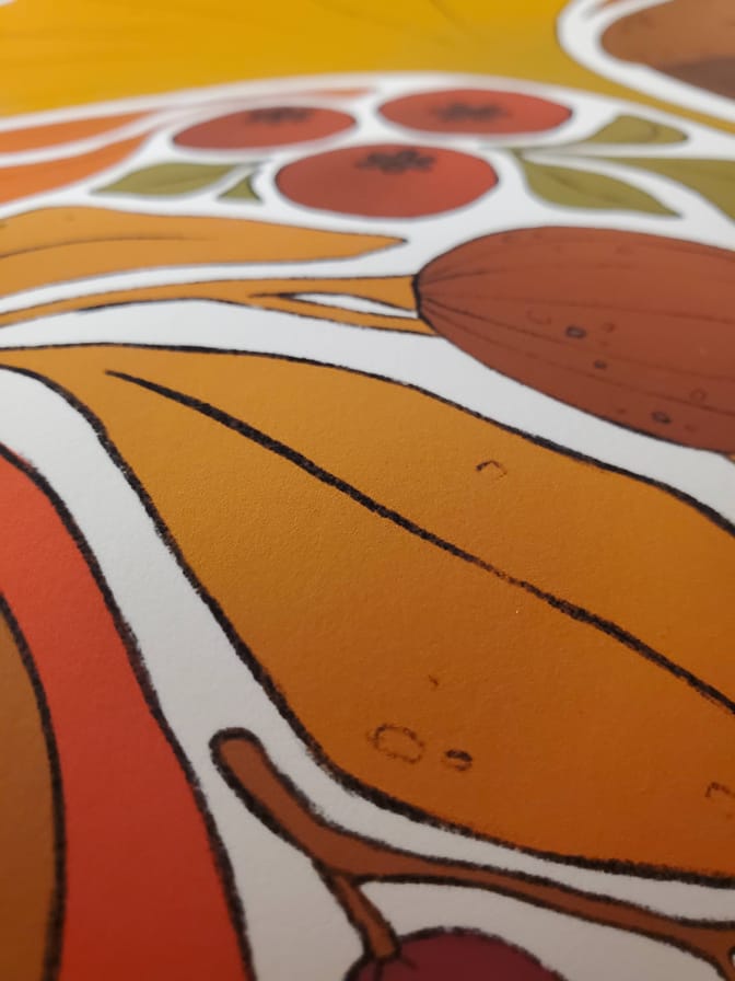
“Autumn Colours” close up, you can see the strokes!
This is one of the biggest differences between a professional giclée print and a poster. From across the room, they might look similar. Up close, it's a completely different experience. Giclée printing uses 8 to 12 ink channels to produce smooth, accurate colour. Poster printing uses cheap toner or dye and it shows as soon as you lean in.
Colour Accuracy
Does the print actually look like the image you saw online? (Accounting for screen differences, which are real.) Cheap prints often look washed out, oversaturated, or just slightly off. The greens are wrong. The skin tones are flat. Something feels "not quite right" even if you can't pinpoint it.
Good prints are colour-managed. That means someone compared the digital file to the physical print and adjusted until they matched. This is tedious, skilled work. At our studio, every new design gets test-printed on our Canon PRO-1000 before it ever goes to production. If the colours don't translate well to paper, it doesn't ship.
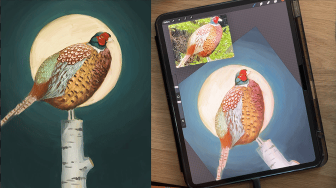
Testing colours on “Rocco” while painting!
Cheap prints skip this step entirely. The file goes straight to a printer and whatever comes out is what you get.
Will It Yellow?
Acid-free paper won't yellow. Non-acid-free paper will, sometimes within a few years. The difference is in how the paper is made. Cotton rag paper is naturally acid-free. Wood pulp paper (what posters use) contains lignin, which breaks down over time and turns the paper yellow and brittle.
If the listing doesn't mention acid-free, assume it isn't. This matters more than most people realize. A print that looks great today but turns yellow in three years isn't a good print. It's a temporary decoration.
Check What They DON'T Tell You
Good print sellers list the paper type, ink type, and print method. They'll tell you it's giclée on cotton rag with pigment inks, or something equally specific. They're proud of their materials and they want you to know about them.
If all you get is "high quality print" with no specifics, be skeptical. Vagueness is a red flag. "High quality" means nothing without details to back it up. Same goes for "premium materials" or "professional grade." These are marketing words, not material specifications.
We list everything about our print materials and terminology because we want you to know exactly what you're getting. If a seller doesn't do the same, ask yourself why.
The Smell Test (Literally)
This one sounds ridiculous, but it works. Cheap prints sometimes smell like a copier. Toner, heat, that warm plastic smell. Fine art prints don't really smell like anything. Maybe a faint paper smell, but nothing chemical or industrial.
Not scientific. But weirdly reliable.
Price as a Signal
Very cheap prints are almost always bad quality. That's just the reality of what materials cost. If someone is charging eight dollars with free shipping for a framed print, every single component has been optimized for cheapness. The paper, the ink, the frame, the glass. Something got cut at every stage.
Expensive prints aren't automatically good either, though. Plenty of brands charge premium prices for mediocre materials. Price is a floor, not a guarantee. But if someone is charging $40+ for a single unframed print, they're probably using real materials. The economics don't work otherwise.
If you want to understand what actually goes into the cost of a fine art print, I wrote about that too: what makes a fine art print worth the price.
The Short Version
Look for: cotton or rag paper (200+ gsm), pigment-based archival inks, giclée printing, acid-free materials, and specific information about what you're buying. Avoid: vague descriptions, suspiciously low prices, and anything that smells like a Xerox machine.
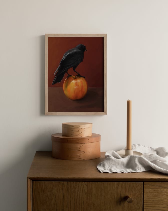
“Crownelius” framed on a wall
Browse our collections to see what good quality looks like. Or read more about the difference between fine art prints and posters and how to care for your prints once you have them.