Fine art prints use archival inks on heavy cotton paper. They last decades. Posters are mass-printed on thin stock and fade fast. They look kinda similar at first glance. Both flat pieces of paper with an image on them. So why is one twenty bucks and the other something you actually save up for? Let's break it down.
1. Paper: The Foundation
Posters are usually printed on cheap, glossy stock. Think magazine pages, just bigger. It’s made from wood pulp, bleached, coated, and designed to be cheap and fast to run through giant presses. Nobody making poster paper is thinking about what it’ll look like in five years, let alone fifty.
If you’ve ever taped a poster to your wall and forgotten about it, you’ve seen what happens. Edges curl. Colors fade. The paper yellows. It eventually gets that sad, brittle feel when you try to move it.
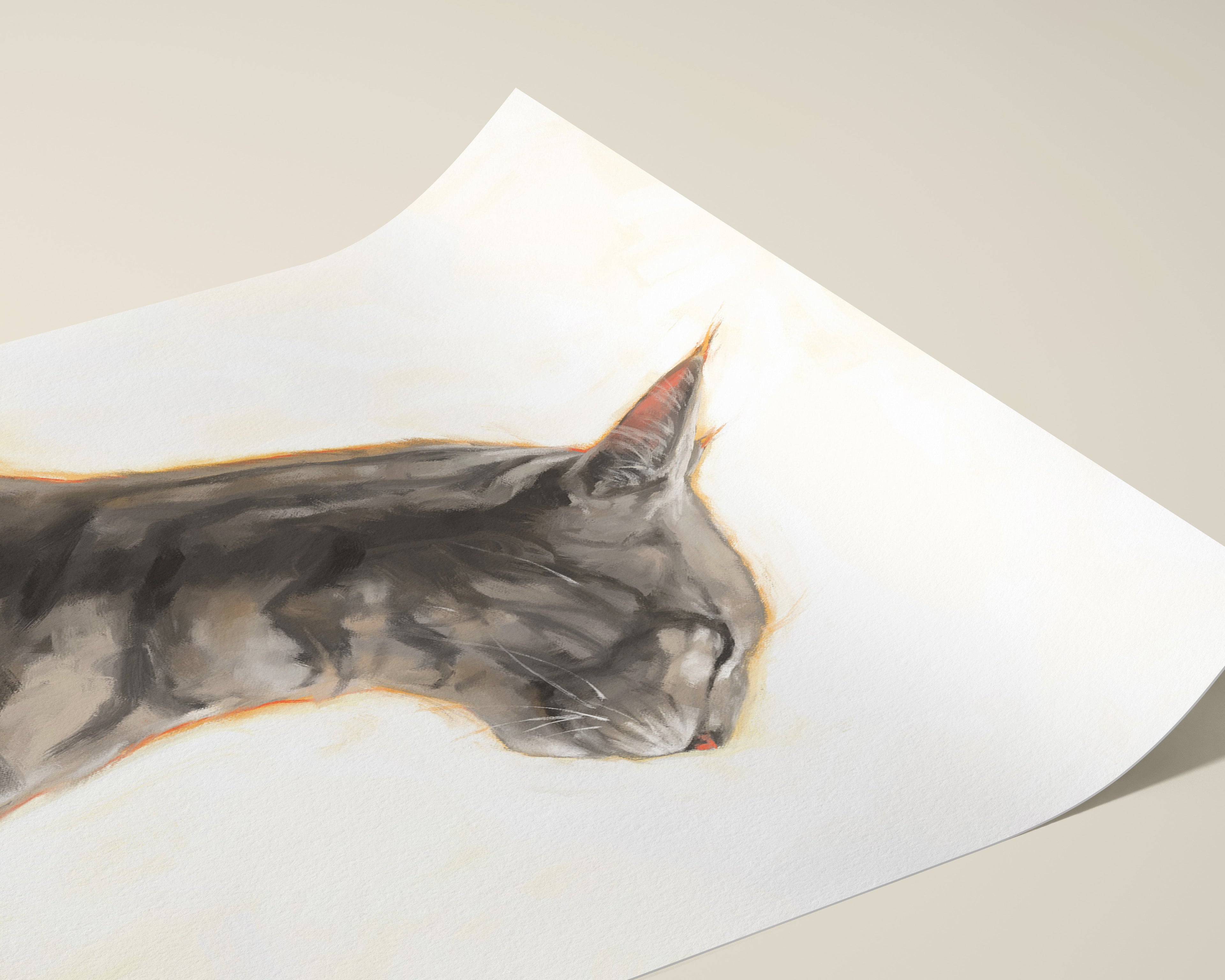
For my prints, I use Hahnemühle Photo Rag and Epson Hot Press paper depending on where it’s shipping from. For my watercolour collection, I use Hahnemühle German Etching, which has a textured surface that gives the image a beautiful, tactile quality. These are thick, 100% cotton, acid-free papers. No pulp. No cheap coatings. They’re made to last.
When you pick one up, you can feel the difference immediately. It’s weighty, soft, and almost velvety. The texture isn’t just for show either. It’s what holds the pigment in place and gives the artwork that depth you can’t get on slick poster stock. You’ll notice it the moment you unbox one of our fine art prints.
2. Price 💸
This is where the difference really shows up. Everything that goes into a fine art print costs more. The paper is archival cotton rag, not thin glossy stock. Pigment inks are pricier than the dyes used for posters. The printers are specialized machines built for accuracy, not to churn out huge volumes fast - like our Canon imagePROGRAF PRO-1000 in the studio.
On top of that, the production itself is slower and more careful. Each print is made individually, checked, trimmed, and packed so it arrives looking perfect. It’s a completely different process from mass-printing posters by the thousand.
All of that adds up. Posters are cheap because they’re fast and simple to make. Fine art prints aren’t, and the price reflects that.
3. Printing: Smash vs Spray
Poster printing is all about speed. It’s usually done with offset lithography or digital toner printers. Imagine a giant roller slapping down layers of cheap dye or toner onto glossy paper as fast as possible. It’s great for bulk runs, not so great for detail or longevity. The inks fade quickly in sunlight, and up close you’ll see banding, fuzziness, or just a general lack of crispness.
For fine art prints, I use giclée printing - high-resolution inkjet printing with archival pigment inks. Instead of smashing ink on top, the printer sprays tiny droplets of pigment into the paper fibers. Pigment is different from dye. It’s made of solid particles, so it stays put and doesn’t break down as fast. This is why museums use pigment printing. If you want the deep dive, read Archival Inks vs. Regular Inks.
The result is smooth gradients, accurate colors, deep blacks, and detail you just don’t get on posters. And because these are made one at a time, they’re actually checked and handled like individual pieces, not churned out in a stack of a thousand.
4. Color and Detail: The Up-Close Test 👀
Stand nose-to-paper with a poster and you’ll see it right away. The colors are a bit flat, edges can look fuzzy, and there’s not much depth. Posters are designed to be seen from a few feet away, not scrutinized.
Do the same with a fine art print and it’s a different story. Linework is crisp, shading is smooth, and the colors pop in a way that doesn’t look artificial. On textured paper like German Etching, the image actually feels like it’s sitting in the paper, not floating awkwardly on top. Light interacts differently too. It doesn’t reflect like a glossy surface. It’s more subtle and rich.
I’ve had people mistake some of my watercolour prints for originals when they see them in person. That’s the difference in both paper and process doing their thing together. If you’re picking pieces for your home, it’s worth knowing how to spot print quality issues before you buy.
5. 🧓 Longevity: One Ages Like Milk, the Other Like Wine
Posters aren’t built to last. The paper is acidic, the inks are cheap, and they’ll start to degrade before long. Even if you baby them, they’ll yellow, curl, and fade. That’s just the reality of the materials.
Fine art prints are made to archival standards. Cotton rag paper and pigment inks are stable for decades. If you frame a print properly with UV-protective glass, it’ll look basically the same years down the line. Even unframed but stored in archival sleeves, they hold up astonishingly well. There are pigment prints from the 90s that still look fresh. Posters from the 90s? Not so much.
For tips on keeping your prints in great shape, check out my care guide and how collectors store and display them. We also offer pre-framed prints if you want to skip the framing headache entirely.
6. Intent and Value
A poster is meant to decorate. It’s temporary. Cheap to make, cheap to replace. Nothing wrong with that.
A fine art print is meant to be something. It’s not a one-time wall filler, it’s a way to own a faithful, lasting reproduction of a work. Collectors care about that. A signed, numbered print on archival paper can hold its value or even increase over time. Posters just don’t. No one’s auctioning off their old crinkled IKEA poster in 2040.
If you’re curious how limited runs work, I wrote about the headaches and perks in Limited Edition, Unlimited Headaches and broke down limited vs. open editions too.
Final Thoughts
Yeah, I know they look similar at a glance. But once you know what’s actually going on with the materials and printing, it’s a whole different world. One is decoration. The other is a lasting piece of art. If you just want something quick to fill a wall, a poster is fine. If you want something that’s going to stay beautiful for years, fine art prints are where it’s at. Start with a piece from our bestsellers or browse our print collections and see the difference up close!