

People ask me this a lot: how does something I made on an iPad turn into a real print? It's a fair question. The gap between "drawing on a screen" and "archival fine art print on your wall" is not obvious, and the process is worth explaining properly.
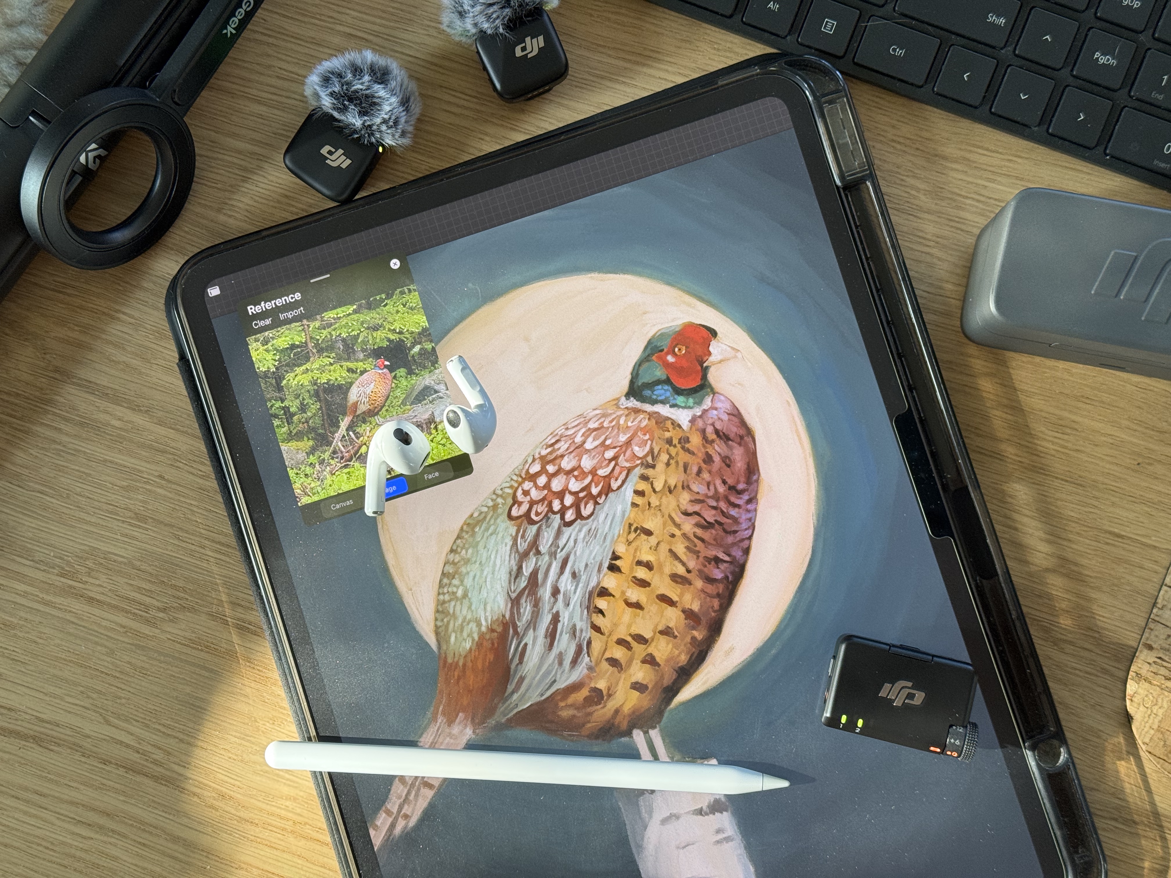
It starts in Procreate
I paint in Procreate on an iPad Pro. Before Procreate I'd been using Photoshop for decades: all through art school, and then for years in my VFX day job, working on feature films, from b movies to big blockbusters. I knew digital painting inside and out. But Procreate on the iPad is a completely different experience from Photoshop on a desktop. I stumbled into it at an Apple Store, tried it for maybe fifteen minutes, and realized I couldn't go back. I made a reel about it if you want the story.
Resolution, layers, and brushes
Resolution matters more than anything else when you set up a file, and it's the one thing you can't fix later. A 16x20 print at 300 dpi needs a file that's 4800 by 6000 pixels. Larger sizes need more. If the original is too small, the print comes out soft and pixelated, and no one wants that!.
The tradeoff is that the bigger the canvas, the fewer layers Procreate lets you keep, and the slower the iPad gets. The Apple Pencil starts lagging when you're working on a huge file, and responsiveness drops off noticeably. For pieces I know I'll want to print at wall size, I go as large as the iPad will let me. But for our Thursday livestreams I keep it at 4800 by 6000, so everything stays snappy while I'm painting on camera.
Like most digital painting apps, Procreate supports layers, but I keep them to a minimum to preserve a painterly feel. I start with an underpainting layer to knock back the bright white canvas, kept separate so it doesn't blend with anything on top (the digital equivalent of letting a ground coat dry). I'll often add a red layer underneath my work to push warmth through the piece, then do all my actual painting on a single layer, letting the colors mix naturally for that traditional, organic look.
There are a ton of brush options with Procreate, but the ones I use most are Classic Paints by Sadie Lew, a Procreate brush set that mimics classical oil paint strokes and has a beautiful canvas texture baked in. I've also been experimenting with Eldar Zakirov's Perfect Oils, which has an impasto option that gives strokes real thickness and dimension, closer to the way paint actually sits on canvas. I want my pieces to have a soft, painterly quality, and these brushes help me achieve that!
When the painting is done, I send it over to my computer and move on to the next step.
Getting the colour right before anything is printed
This is the part people don't think about, and it's honestly where things can go wrong if you're not paying attention. Screens emit light. Printers use ink on paper. These are two completely different ways of producing colour, and they do not automatically agree with each other.
What you see on a monitor is in RGB colour mode. Printers work in CMYK, or for pigment ink printers, a wider gamut that includes additional ink channels. Some colours that look vivid on a screen, especially bright blues and dark blacks, are hard or impossible to reproduce in print. They're outside what's called the "gamut" of the printer and paper combination.
I soft-proof my files before printing, which means using colour management tools to simulate on screen what the file will look like coming off the printer. I use printer profiles for the specific paper I'm printing on, and if something looks off I adjust it. It's not a fast step, but skipping it is how you end up with prints where the colours look flat or wrong compared to the original painting.
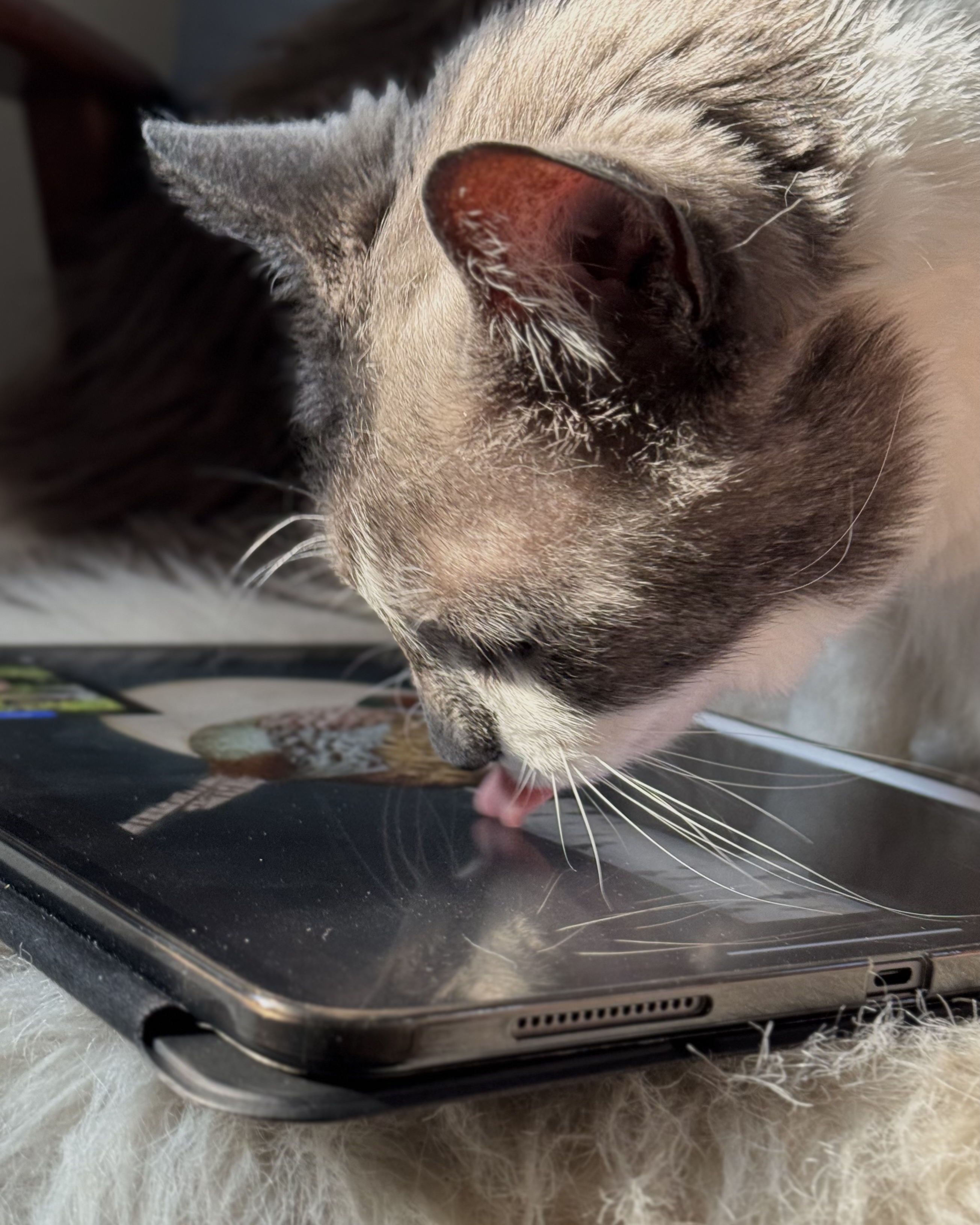
Woodhouse gets a pass on every painting too!
The paper and the ink
I print in-house on a Canon imagePROGRAF PRO-1000. It's a large-format 12-channel pigment ink printer designed for photography and fine art reproduction. The twelve ink channels matter a lot for longevity and colour accuracy. Pigment inks are significantly more resistant to fading than dye-based inks. A properly stored pigment ink print on archival paper is rated to last well over a hundred years without noticeable colour shift. Dye-based prints are not.
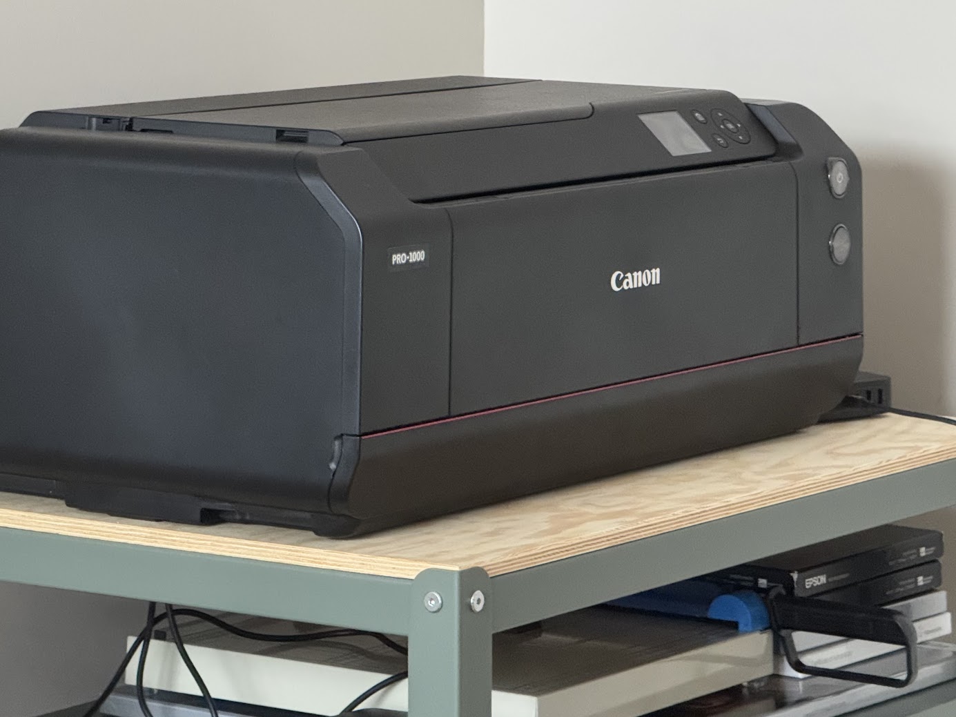
Old (un)faithful, our Canon imagePROGRAF PRO-1000.
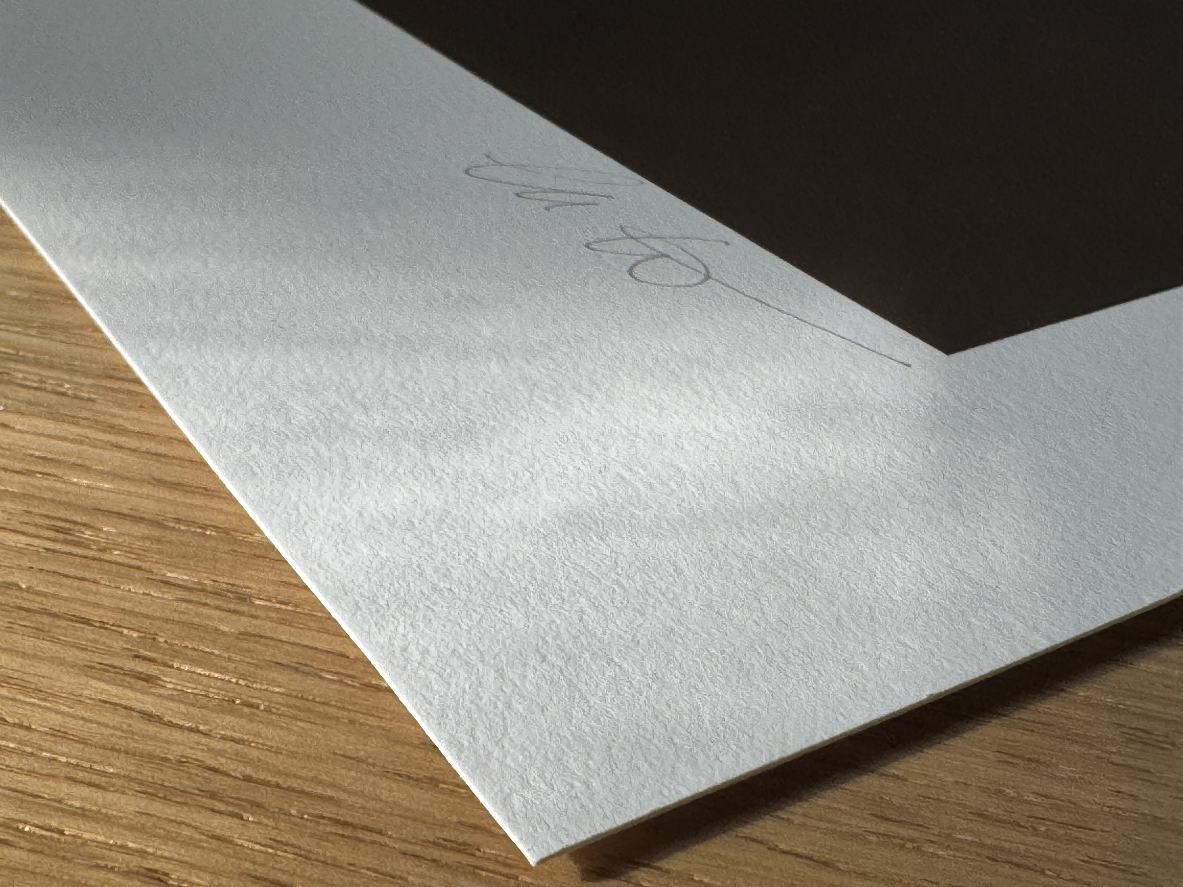
For open edition prints I use Epson Hot Press Bright White. "Hot press" means the surface is smooth, which holds fine details and clean lines, and the paper is acid-free and archival. For limited editions I use Hahnemühle Photo Rag 308, a similar high-quality paper that's well known in the fine art printing community. It pairs well with pieces I'm signing and numbering. For my watercolour pieces, I use Hahnemühle German Etching, which has a beautifully textured surface that works really well with loose, painterly brushwork. It makes the print feel closer to an original painting.
The paper choice is not decorative. Different surfaces interact differently with the ink. A textured paper makes soft brush strokes look more natural. A smooth paper makes crisp linework look cleaner. Matching the paper to the piece is part of getting the print to look right. How we choose our fine art paper goes into more detail on this if you want it.
In-house vs regional partners
Limited editions get printed right here in my home studio. That's because I need to sign and number each one and include the certificate of authenticity, and that whole process is much simpler when the print comes off my own machine. Smaller open editions going to Canadian customers also get printed in-house.
For larger prints, and for anything going to the US, UK, or Europe, I work with regional print partners. Currently that's a studio in the US, one in the UK, and one in Germany. Shipping a rolled fine art print across an ocean is not a great idea. You get customs delays, damaged tubes, and a carbon footprint the size of a small country. Framed prints for the US and Canada also go through our partners, because framing is a whole other level of complexity we can't handle from our home studio.
These are professional fine art print labs, not consumer print shops. They use the same class of archival papers and the same pigment inks we use here. But some of them print on Epson-brand printers instead of Canon, and even with the same file and the same paper, different printer brands produce slightly different results. So for every new piece with every partner, I order test prints and compare them side by side with mine. If the match isn't right, I adjust the file and retest. This adds time and it adds cost, but it's the only way to make sure a print shipped from London looks the same as one shipped from my studio. I wrote more about what we've learned from a year of shipping art around the world if you want the longer story.
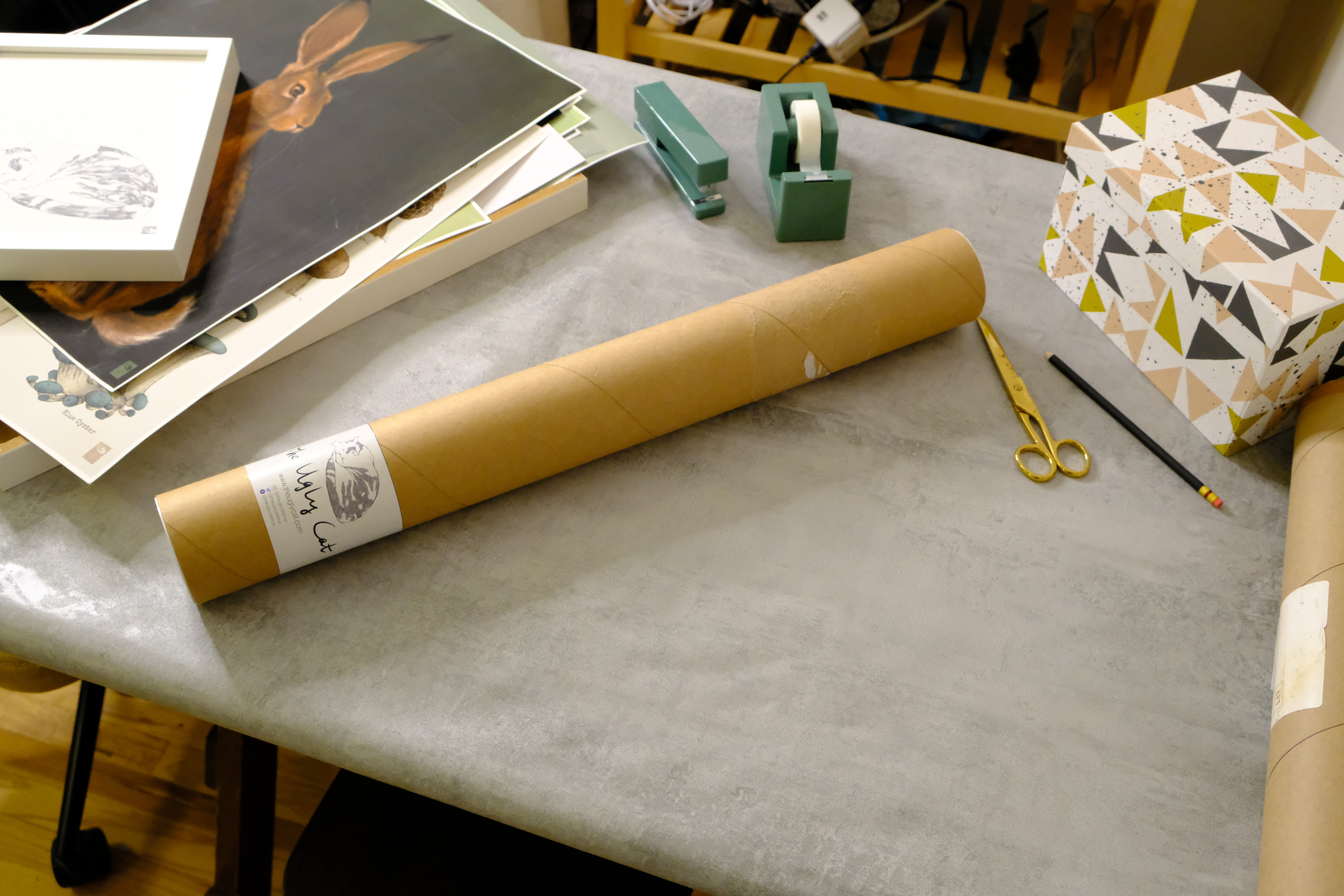
What "fine art print" actually means
The term gets used loosely, which is frustrating. A fine art print, done properly, means archival paper, pigment-based inks, and a colour-managed process from file to finished print. The thing should last decades on your wall without fading if it's kept out of direct sunlight. The colours in the print should match what I painted, not some degraded version of them.
A lot of cheap prints are made on uncoated paper with dye inks, which fade noticeably within a few years, sometimes faster if they're in a bright room. They're inexpensive because the materials are inexpensive. There's nothing dishonest about that, but they're not the same thing, and I think it's worth being clear about the difference. If you want to go further on this, I wrote about why professional giclée prints beat home printing every time.
The part that still surprises me
I've been doing this long enough that the process is familiar, but there's still something a little strange about holding a print in my hands for the first time. I made the painting entirely on a screen, layer by layer, and at some point it becomes a physical object. It has weight and texture. You can frame it and hang it on a wall and it will still be there in fifty years!